VaxMap 2.0: West Health Policy Center and University of Pittsburgh School of Pharmacy Develop County-Level Map of Potential COVID-19 Vaccine Locations
Mapping Vaccine Access Gaps to Support Equitable COVID-19 Distribution Efforts
February 3, 2021EXECUTIVE SUMMARY
Introduction
Preparedness and planning are of upmost importance to ensure a timely and equitable administration of COVID-19 vaccines among the U.S. population. Geographic information systems analysis can be used to inform the design of vaccine distribution and administration plans. These analyses can identify limitations in the existing health care facility infrastructure to ensure that vaccines reach residents with low access to health care facilities.
We conducted a geographic information systems analysis to quantify access to potential COVID-19 vaccine administration facilities, including community pharmacies, federally qualified health centers, hospital outpatient departments, and rural health clinics. To disseminate our findings, we developed an interactive visualization.
Methods
We used ArcGIS to map potential COVID-19 vaccine administration facilities, including community pharmacies that provided immunization services as of October 1, 2020, federally qualified health centers, hospital outpatient departments, and rural health clinics. The U.S. population was characterized with the 2010 U.S. Synthetic Population developed by RTI International. For a 1% sample of the synthetic population, we calculated the driving distance to the closest facility using ArcGIS Network Analyst and a national transportation dataset. We performed subgroup analyses for residents aged 65 years or older.
Results
We identified 68,128 potential COVID-19 vaccine administration facilities, including 51,207 community pharmacies, 12,464 federally qualified health centers, 3,191 hospital outpatient departments, and 1,266 rural health clinics. The county-level mean (median) number of facilities per 10,000 residents was 2.8 (2.3). 37% of U.S. counties had 2 or fewer facilities per 10,000 residents, and 9% of U.S. counties had fewer than 1 facility per 10,000 residents. The highest concentrations of counties with fewer than 1 facility per 10,000 residents were in Texas, Kansas, Nebraska, Virginia, and Montana.
The mean driving distance to the closest potential vaccine administration facility was 2.2 miles for the general population and 2.4 miles for residents aged 65 years or older. Across the U.S., nearly half of the population (49%) lived within 1 mile of a potential administration facility, 74% within 2 miles, 89% within 5 miles, and 97% within 10 miles.
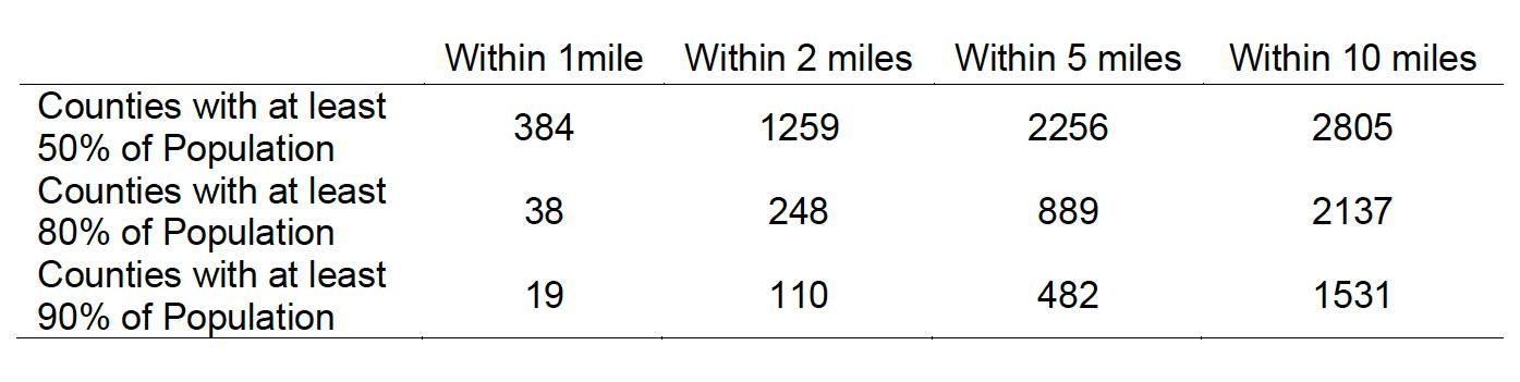
In 36 states, at least 80% of the population lived within 5 miles from a facility. In 45 states, at least 90% of the population lived within 10 miles of a facility. Specifically, in North Dakota, South Dakota, Montana, Wyoming, Nebraska, and Kansas, over 10% of the population had a driving distance greater than 10 miles to the closest facility.
State-level variation masked substantial variation at the county level. In 28% of U.S. counties, at least 80% of the population lived within 5 miles of a facility. In 49% of counties, at least 90% of the population lived within 10 miles of a facility. 32% of U.S. counties had at least 20% of residents with a driving distance greater than 10 miles to the closest facility. Furthermore, 11% of counties had at least 50% of the population with a driving distance greater than 10 miles. The highest concentrations of counties with at least 50% of the population with a driving distance greater than 10 miles were in Texas, Nebraska, Kansas, South Dakota, and Montana.
We identified 69 counties where Black residents had a significantly higher risk than White residents of having a driving distance greater than 1 mile to the closest potential COVID-19 vaccine administration facility. These 69 counties accounted for a total population of 26.3 million residents, including 6.6 million Black residents. The highest concentrations of these counties were in GA (9), MS (7), AL (7), LA (6), TX (6), VA (6). A third of the counties with significant disparities were located in urban areas, including Fulton County, GA (Atlanta), DeKalb County, GA (Atlanta), Dallas County, TX (Dallas), Harris County, TX (Houston), Tarrant County, TX (Fort Worth), Wayne County, MI (Detroit), Orleans County, LA (New Orleans), and Queens County, NY (NYC). We also identified 94 counties where Black residents had a significantly higher risk than White residents of having a driving distance greater than 10 miles to the closest facility. The highest concentrations of these counties were in VA (16), GA (10), SC (7), TX (7), AL (6), MS (6), NC (6).
Discussion
There exists large variation in population access to potential COVID-19 vaccine administration facilities, particularly at the county level. This variation highlights the need for public health officials to follow a data driven approach in tailoring vaccine distribution and administration plans to the limitations of existing local infrastructures. Our interactive visualization is an open access tool that may aid public health authorities in the identification of geographic areas with lower access to existing health care facilities and that necessitate additional infrastructure for timely and equitable vaccine administration.
Acknowledgements
This project was funded by the West Health Policy Center.
We would like to thank Dr. David Kieran for his help with the conception of the study and Kenneth Richardson for his assistance compiling facility data.
INTRODUCTION
Preparedness and planning are of upmost importance to ensure a timely and equitable administration of COVID-19 vaccines among the population. The Centers for Disease Control and Prevention and the Department of Health and Human Services have called upon state and local authorities to design vaccine distribution and administration plans that address limitations of the existing health care infrastructure and ensure a timely and equitable vaccine administration to all individuals.
Geographic information systems (GIS) can be used to map population data in relation to current health care facilities to assist state and local authorities in planning for more complete vaccination coverage during the COVID-19 pandemic. GIS analyses can identify gaps in existing infrastructure, thereby empowering public health authorities with the information needed to design vaccine distribution and administration plans that ensure that vaccines reach residents with low access to health care facilities.
To this end, we mapped potential COVID-19 vaccine administration facilities across the U.S., including community pharmacies that provide immunization services, federally qualified health centers, hospital outpatient departments, and rural health clinics. Our analyses focused on these facility types because each type has capacity to handle high volume of vaccination over a short period of time. We used network analyses to estimate driving distance to the closest facility for a 1% sample of a synthetic population of the U.S. For each county, we measured the proportion of population within 1, 2, 5, and 10 miles to the closest facility. We identified counties where a large proportion of the population had a long driving distance to the closest facility, or where Black residents were more likely to have a distance >1 mile or >10 miles to the closest facility compared to White residents. To disseminate our findings, we developed an interactive open access visualization that may aid state and local authorities in the identification of areas with low access to the existing health care facility infrastructure.
METHODS
Data Sources
We obtained DataQ from the National Council for Prescription Drug Programs, a comprehensive data product that contains information for all community pharmacy locations in the U.S. We selected community pharmacies that provided immunization services as of October 1, 2020. We obtained from the Health Resources and Services Administration the addresses of federally qualified health centers, and from the Centers for Medicare and Medicaid Services the coordinates of rural health centers and the addresses of hospital outpatient departments. The U.S. population was characterized with the publicly available 2010 U.S. Synthetic Population developed by RTI International. Finally, 2019 U.S. Census Bureau data was used to obtain most recent state and county population estimates.
Analyses and Outcomes
We mapped facilities using ArcGIS, version 10.7 (Esri). For community pharmacies, federally qualified health centers, and hospital outpatient departments, the location was generated with ArcGIS World Geocoding Service using address information (the rural health clinic data contained facility coordinates). For a 1% random sample of the U.S. synthetic population (n=2,982,544), we calculated the driving distance in miles to the closest facility within the state using ArcGIS Network Analyst and the U.S. Geological Survey National Transportation Dataset.
For each county, we calculated counts of facilities; facility density, defined as the number of facilities per 10,000 residents; average driving distance to the closest facility; proportion of population within 1, 2, and 5 miles to the closest facility; proportion of population aged 65 years or older within 1, 2, and 5 miles to the closest facility; proportion of population with >10 miles distance to the closest facility; and proportion of population aged 65 years or older with >10 miles distance to the closest facility.
Using the race data available in the Synthetic Population, we calculated the excess risk of having a distance >1 mile or >10 miles to the closest facility for Black compared to White residents at the county level. To test the significance of these associations, we conducted logistic regression models stratified by county that evaluated the association between race and distance >1 mile or >10 miles.
Finally, we developed a risk score that combined the facility density and the proportion of population with driving distance less than 10 miles from a facility to stratify counties by risk. The risk score ranges from 0 (lowest risk) to 6 (highest risk). To calculate the risk score, counties were categorized into quartiles of facility density and quartiles of the proportion of population less than 10 miles from a facility. The risk score was then calculated as 8- quartile number for facility density -quartile number for population less than 10 miles from a facility. Counties in the first quartile of facility density (lowest density) and in the first quartile of proportion of population less than 10 miles from a facility (highest proportion with long driving distances) where assigned the highest risk (6). Counties in the fourth quartile of facility density (highest density) and in the fourth quartile of proportion of population less than 10 miles from a facility (lowest proportion with long driving distances) where assigned the lowest risk (0).
We developed an interactive visualization to display county-level estimates for counts of facilities, facility density, the proportion of population with >10 miles distance to the closest facility, the proportion of population aged 65 years or older with >10 miles distance to the closest facility, the excess risk of having a distance >10 miles to the closest facility for Black compared to White residents, and the risk score.
RESULTS
Facility Count
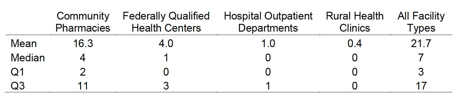
We identified 68,128 potential COVID-19 vaccine administration facilities, including 51,207 community pharmacies, 12,464 federally qualified health centers, 3,191 hospital outpatient departments, and 1,266 rural health clinics. The mean (median) number of facilities per county was 21.7 (7) and ranged from 0 to 1,548 (Table 1). The mean (median) number of community pharmacies providing immunizations per county was 16.3 (4) and ranged from 0 to 1,055. One-fourth of U.S. counties had 3 or fewer potential administration facilities.
Table 1 Summary Statistics for Facility Count at the County Level
Facility Density
At the state level, the mean number of facilities per 10,000 residents was 2.3 (median, 2.2), and was lowest in Nevada (1.6), Texas (1.6), Utah (1.7), California (1.7), and Minnesota (1.7). The highest facility density was present in West Virginia (4.6), Alaska (3.9), Vermont (3.5), Maine (3.4), and Kentucky (3.3). At the county level, the mean (median) number of facilities per 10,000 residents was 2.8 (2.3). 37% of U.S. counties (1,174 out of 3,142) had 2 or fewer facilities per 10,000 residents, and 9% of counties (283 out of 3,142) had fewer than 1 facility per 10,000 residents (Figure 1). The highest concentrations of counties with fewer than 1 facility per 10,000 residents were in Texas (45), Kansas (33), Nebraska (32), Virginia (21), and Montana (19).
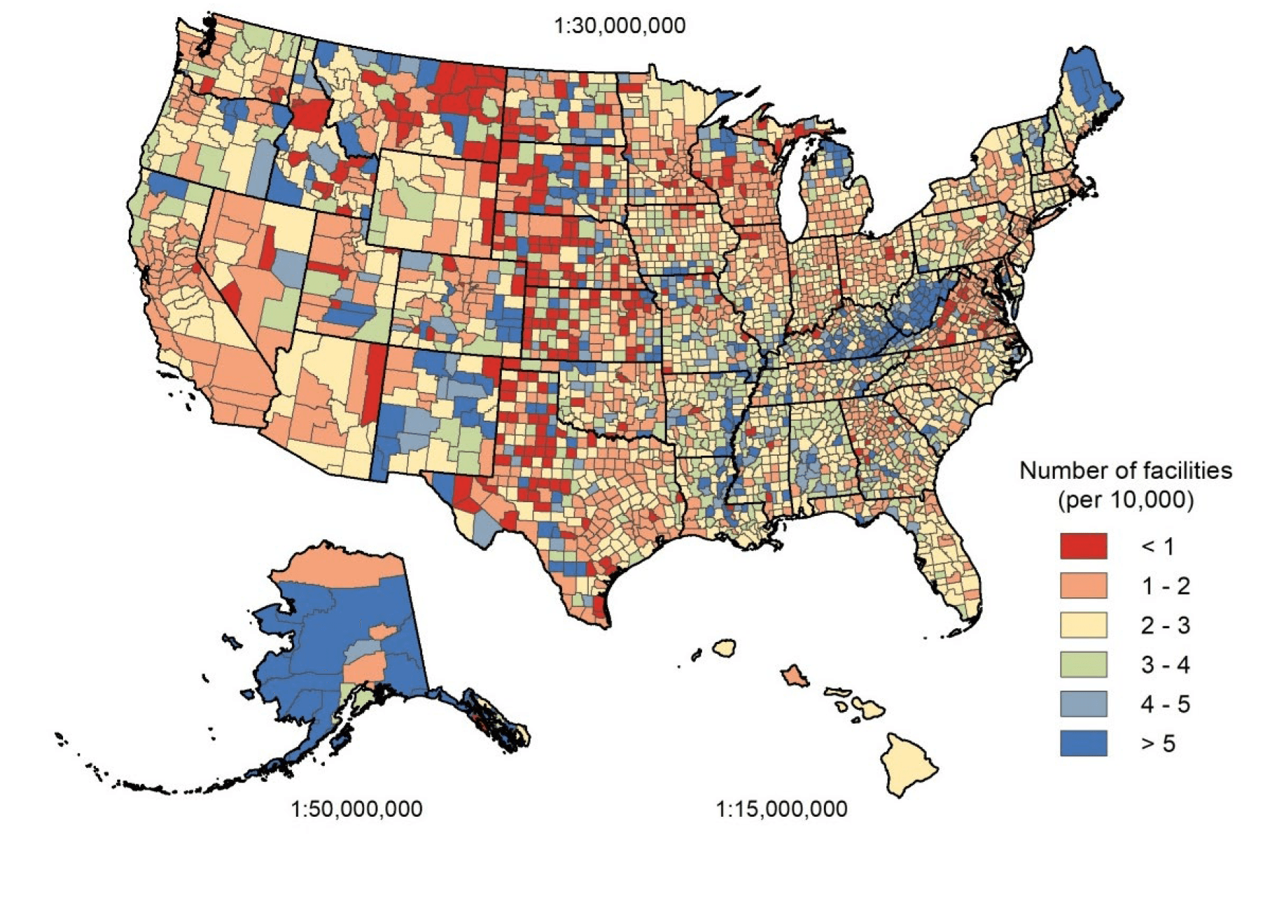
Figure 1 Number of Facilities per 10,000 Residents
Mean Driving Distance to Closest Facility
The mean driving distance to the closest potential vaccine administration facility was 2.2 miles for the general population and 2.4 miles for the population aged 65 years or older. At the state level, the mean driving distance to the closest facility was 2.8 miles (median, 2.6) and was lowest in the District of Columbia (0.4), New Jersey (1.1), California (1.2), New York (1.3), and Rhode Island (1.3). The mean driving distance to the closest facility was highest in Montana (8.3), South Dakota (6.5), Wyoming (5.9), North Dakota (5.8), and Nebraska (4.0).
At the county level, the mean driving distance to the closest facility was 6.5 (median, 4.4) miles. The mean driving distance to the closest facility was greater than 5 miles in 41% of U.S. counties (1,288 out of 3,142) and greater than 10 miles in 11% of counties (332 out of 3,142), Figure 2.
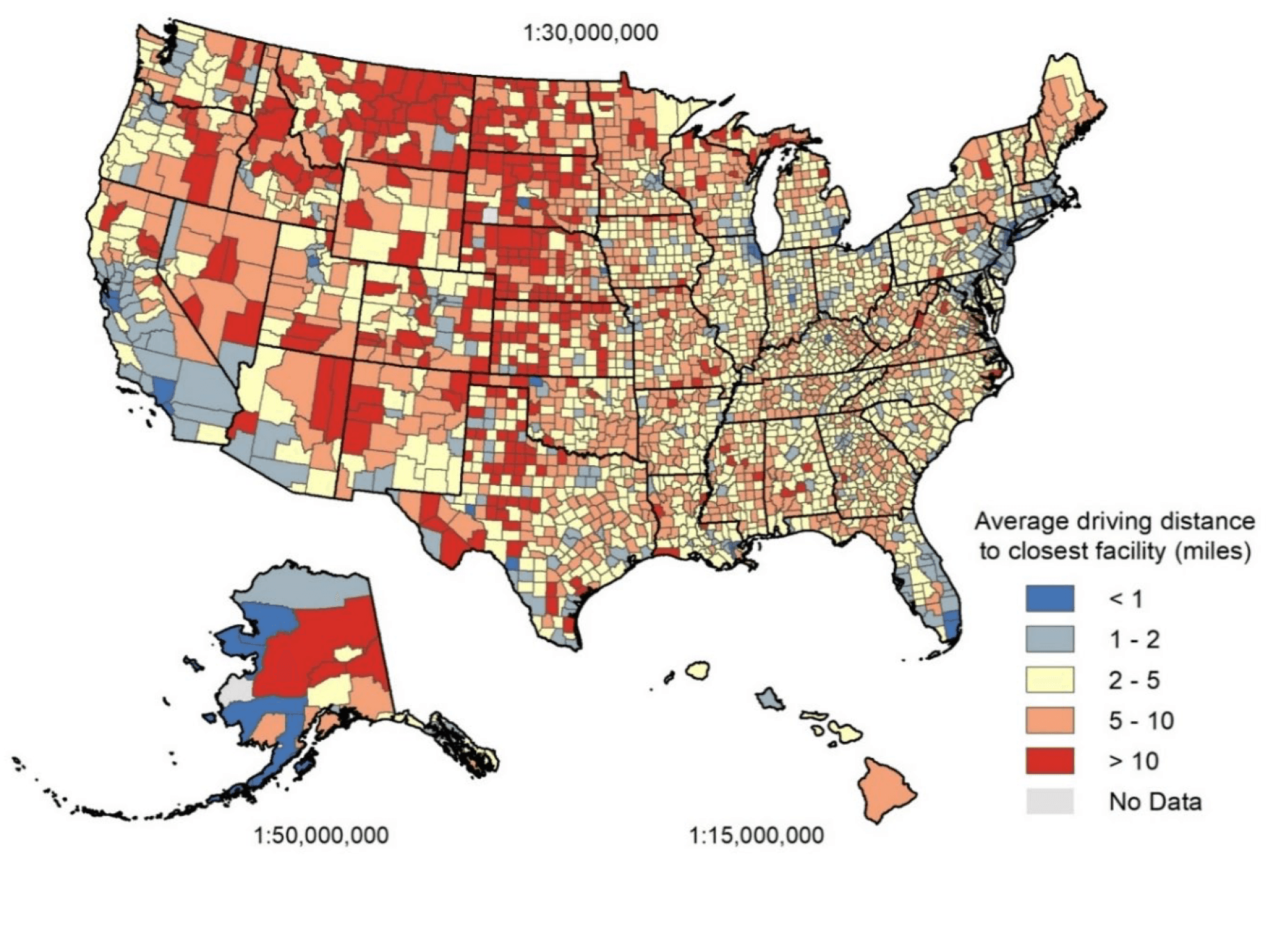
Figure 2 Mean Driving Distance to Closest Facility
Proportion of Population within 1-, 2-, 5-, and 10-Miles Driving Distance to Closest Facility
Nearly half of the general population (49%) lived within 1 mile of a potential vaccine administration facility, 74% within 2 miles, 89% within 5 miles, and 97% within 10 miles. Distances were similar for older adults, with 47% within 1 mile of a potential administration facility, 71% within 2 miles, 87% within 5 miles, and 96% within 10 miles.
In 36 states, at least 80% of the population lived within 5 miles of a facility (Table 2). In 45 states, at least 90% of the population lived within 10 miles of a facility. Specifically, in North Dakota, South Dakota, Montana, Wyoming, Nebraska, and Kansas, over 10% of the population had a driving distance greater than 10 miles to the closest facility.
Table 2 Counts of States with at least 80% and 90% of the Population within 1-, 2-, 5-, and 10-Miles Driving Distance to Closest Facility
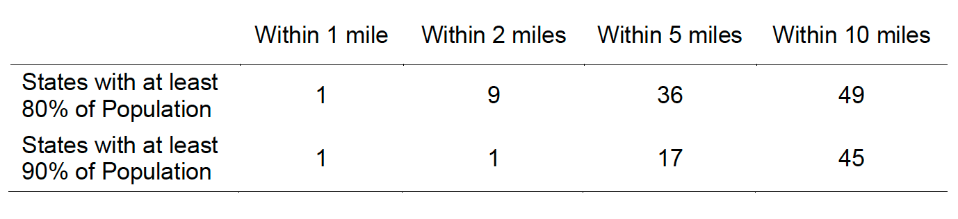
State-level variation masked substantial variation at the county level: In 28% of counties (889 out of 3,142), at least 80% of the population lived within 5 miles of a facility (Table 3). In 49% of counties (1531 out of 3,142), at least 90% of the population lived within 10 miles of a facility.
Table 3 Counts and Proportions of Counties with at least 80% and 90% of the Population within 1-, 2-, 5-, and 10-Miles Driving Distance to Closest Facility
32% of U.S. counties (1,005 out of 3,142) had at least 20% of residents with a driving distance greater than 10 miles to the closest facility, and 11% of counties (337 out of 3,142) had at least 50% of residents with a distance greater than 10 miles. Counties with at least 50% of residents with a driving distance greater than 10 miles were concentrated in Texas (45), Nebraska (40), Kansas (37), South Dakota (31), and Montana (28), Figure 3.
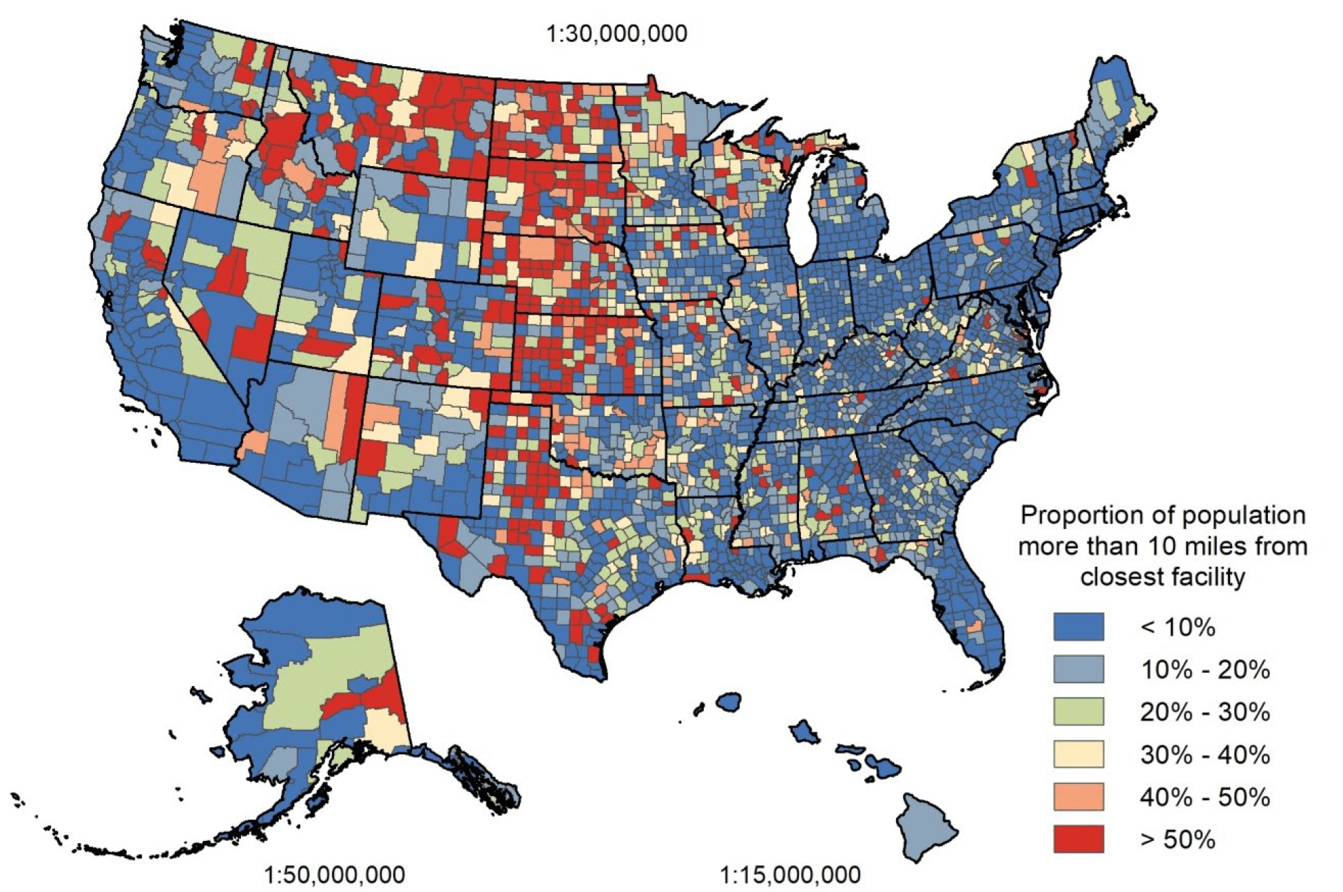
Figure 3 Proportion of Population with Driving Distance Greater than 10 Miles from Closest Facility
The proportion of older adults with a driving distance greater than 10 miles to the closest facility presented a similar distribution to that of the general population: in North Dakota and South Dakota, over 25% of older adults had a driving distance greater than 10 miles to the closest facility. In Montana, Wyoming, Nebraska, and Kansas, over 15% of older adults had a driving distance greater than 10 miles to the closest facility. Nationally, one third of counties (1,049 out of 3,142) had at least 20% of older adults with a driving distance greater than 10 miles to the closest facility. In 12.2% of counties (383 out of 3,142), at least 50% of older adults had a driving distance greater than 10 miles to the closest facility. Counties with at least 50% of older adults with a driving distance greater than 10 miles were concentrated in Texas (47), Kansas (43), Nebraska (40), South Dakota (27), North Dakota (27), and Montana (25), Figure 4.
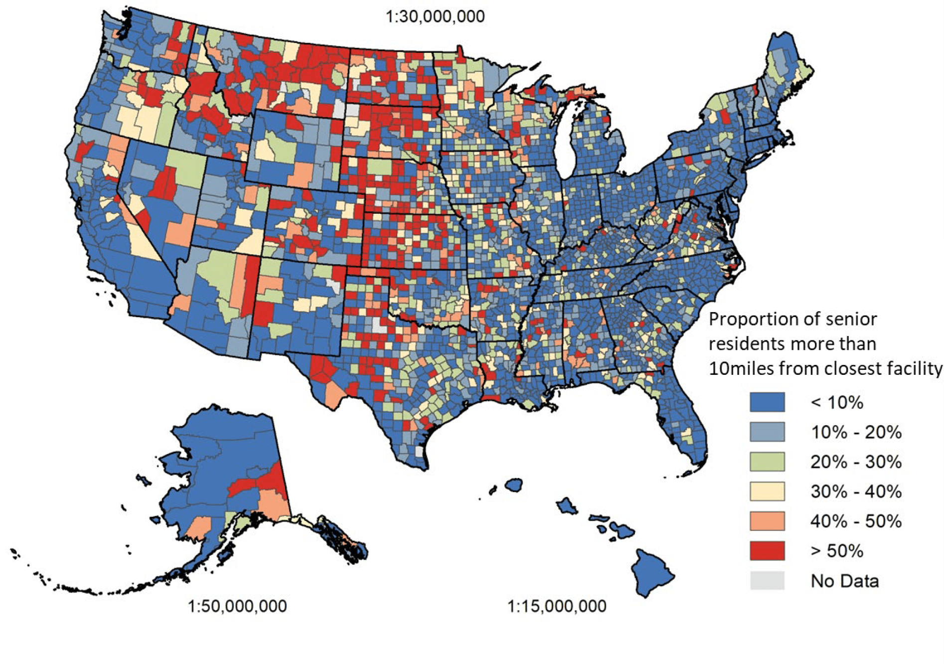
Figure 4 Proportion of Older Adults with a Driving Distance Greater than 10 miles from the Closest Facility
Racial Disparities in Access to Potential COVID-19 Vaccine Administration Facilities
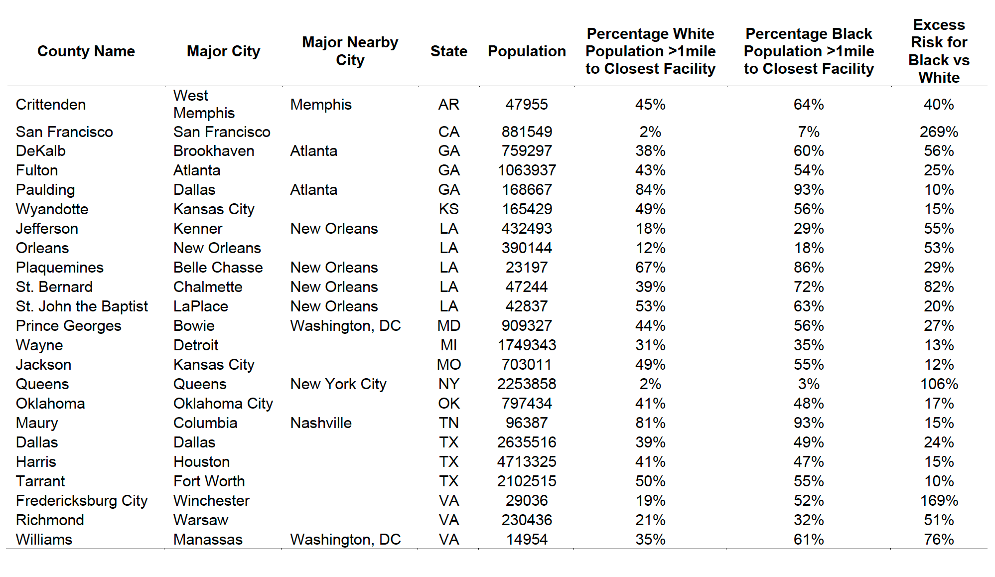
We identified 69 counties, including 23 urban counties, where Black residents had a significantly higher risk than White residents of having a driving distance greater than 1 mile to the closest potential COVID-19 vaccine administration facility. These 69 counties accounted for a total population of 26.3 million residents, including 6.6 million Black residents. The highest concentrations of these counties were in GA (9), MS (7), AL (7), LA (6), TX (6), and VA (6), Figure 5.
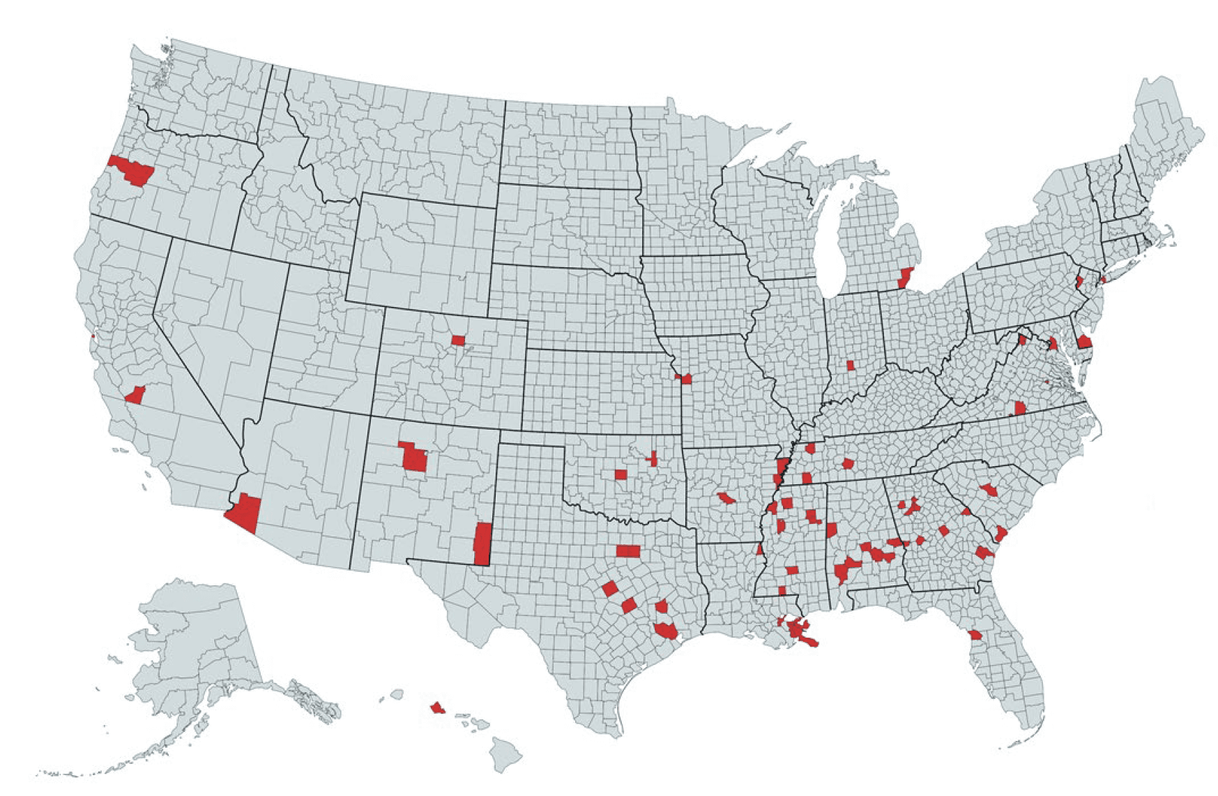
Figure 5 Counties Where Black Residents Were More Likely to Have a Driving Distance >1 Mile
Compared to White Residents
Table 4 lists the 23 urban counties where Black residents had a significantly higher risk than White residents of having a driving distance greater than 1 mile to the closest facility. Urban counties were defined by codes 1 and 2 of the National Center for Health Statistics urban-rural classification scheme for counties. Disparities were particularly large in Fulton County, GA and DeKalb County, GA, both of which are in the Atlanta metropolitan area. The list also included counties that comprise major U.S. cities, such as Dallas County, TX (Dallas), Harris County, TX (Houston), Tarrant County, TX (Fort Worth), Wayne County, MI (Detroit), Orleans Parish, LA (New Orleans), and Queens County, NY (New York City).
Table 4 List of Urban Counties Where Black Residents Were More Likely to Have a Driving Distance >1 Mile Compared to White Residents
We identified 94 counties where Black residents had a significantly higher risk than White residents of having a driving distance greater than 10 miles to the closest facility. The highest concentrations of these counties were in VA (16), GA (10), SC (7), TX (7), AL (6), MS (6), and NC (6), Figure 6. In 236 additional counties, Black residents had a higher risk than White residents of having a driving distance greater than 10 miles to the closest facility, but the difference between the two groups was not significant.
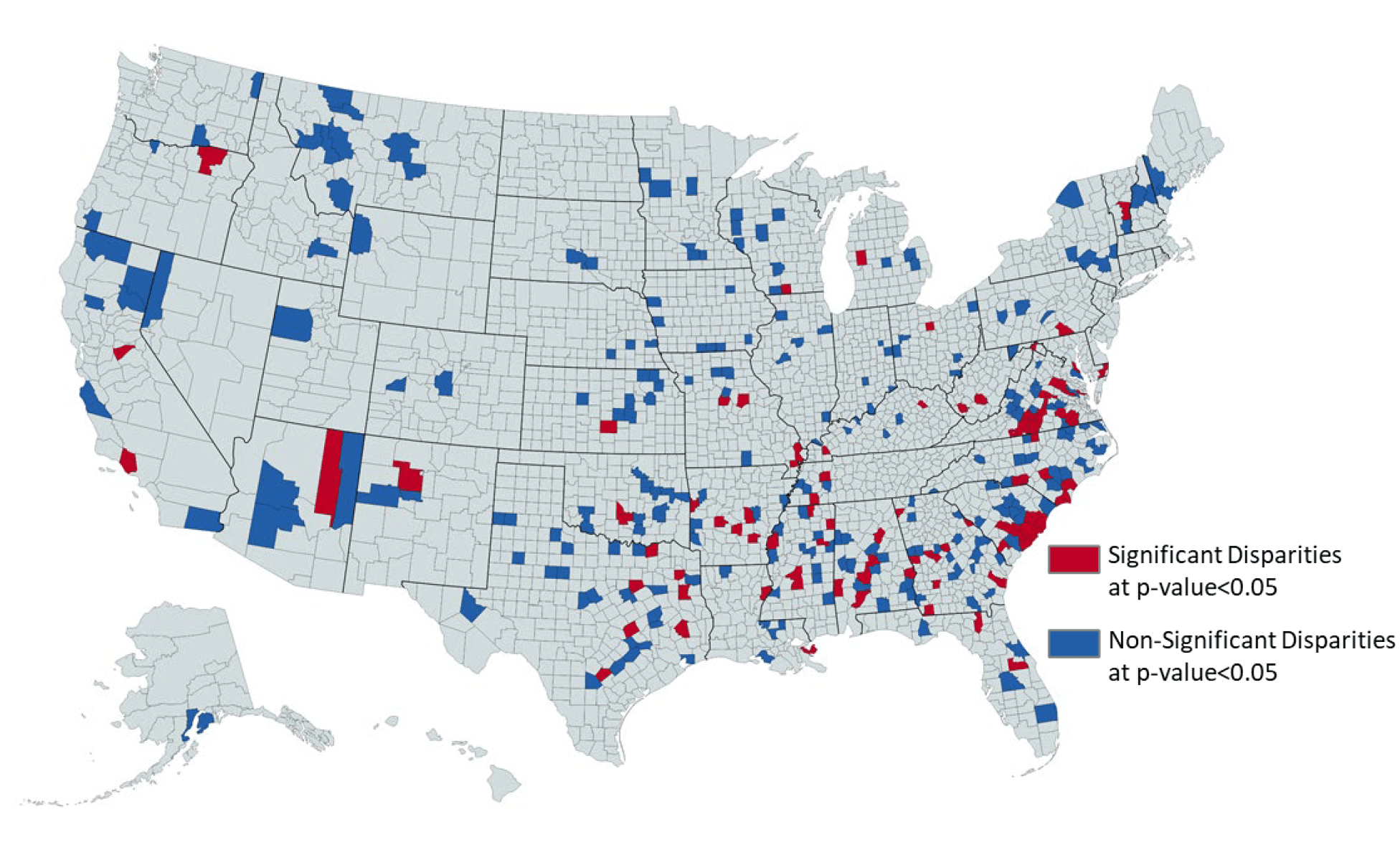
Figure 6 Counties Where Black Residents Were More Likely to Have a Driving Distance
>10 Miles Compared to White Residents
DISCUSSION
To our knowledge, ours is the first GIS analysis to quantify access to the existing infrastructure of a wide range of health care facilities that may serve as locations for COVID-19 vaccine administration. Our study demonstrates how GIS mapping can be used to guide the design of vaccine distribution and administration plans that overcome the limitations of the existing infrastructure and ensure equitable distribution of COVID- 19 vaccines to all individuals.
We observed large geographic variation in population access to potential COVID-19 vaccine administration facilities, particularly at the county level. While only 3% of the U.S. population had a driving distance greater than 10 miles to the closest facility, as many as 1,005 and 337 counties had more than 20% and 50% of county residents with a driving distance greater than 10 miles. These counties represented 4.2% (13.9 million) and 0.6% (1.9 million) of the entire U.S. population. This variation in access demonstrates the relevance of following a data-driven approach in the design of vaccination plans and in the allocation of resources. The large county-level variation observed within states reinforces the need for state and county authorities to collaborate in the development of targeted vaccination plans that overcome the limitations of the local infrastructure.
Areas with higher facility density and thus higher potential vaccine administration capacity did not necessarily correspond to areas with lower average driving distance or with racial disparities, which highlights the need for public health officials to tailor vaccine distribution and administration plans to both the limitations of existing facility infrastructure and population distribution. In areas with short driving distance yet low facility density, authorities may consider adding mass vaccination clinics to increase vaccination capacity and reduce time to vaccinate the desired proportion of the local population. Conversely, areas with high driving distance to the closest facility may benefit from deployment of mobile vaccination clinics to reduce travel-related barriers. In counties where high driving distance is coupled with low facility density, as observed in Texas, Kansas, Nebraska, and Montana, mobile vaccine clinics administering single dose vaccines could be particularly effective, if single dose vaccines were available. Facility density and distance metrics can guide state and local authorities not only in identifying the most appropriate strategy to increase capacity and convenience in each jurisdiction but also in vaccine selection.
Older adults have been included in Phase 1 recommendations for COVID-19 vaccination by the Centers for Disease Control and Prevention. Our analysis highlights areas where a higher proportion of older adults may have barriers to accessing vaccines. Such barriers are of major relevance because older adults are at higher risk for severe COVID-19 disease and may be less likely or able to drive to vaccine administration locations. State and local authorities may use our estimates to allocate resources to increase vaccination rates among older adults. These resources could include deployment of mobile vaccination units and working with community pharmacies that provide in-home vaccination services.
Black Americans face disparities and barriers in the U.S. healthcare system that disproportionately affect Black individuals in comparison to White individuals. As an example, our analysis highlights areas where Black individuals will have to travel farther than White individuals to receive COVID-19 vaccines. Increased drive times to receive COVID-19 vaccines may result in fewer vaccinations among Black individuals, and thus, further widen existing health disparities between Black and White Americans. State and local authorities may use our excess risk score for Black individuals in comparison to White individuals to create opportunities for increased vaccine access for Black Americans. Opportunities may include the deployment of mobile vaccination units to counties where Black individuals have a significantly higher risk than Whites of greater driving times for vaccination. Although our data focus on COVID-19 vaccine administration, our findings demonstrate historical and ongoing disparities in access to healthcare that should be addressed through the establishment of health care facilities in underserved neighborhoods and the improvement of public transportation. This is particularly relevant since Black Americans are less likely to own a vehicle than White Americans.
Limitations
Our analysis is subject to seven main limitations. First, our network analyses were performed on a 1% sample of a synthetic population and thus do not provide a census representation of the U.S. population. Second, because at the time of study there were no data available on which health care facilities would receive COVID-19 vaccines, we mapped facilities that could potentially serve as locations for vaccine administration. It is possible that some of the facilities included in our analyses may not receive or administer COVID-19 vaccines. For these reasons, our findings may not accurately represent true driving distances to receive COVID-19 vaccines. Third, our study did not include Indian Health Services facilities due to the unavailability of high-quality geographic data, which may have upwardly biased driving distances in Arizona, Montana, and South Dakota. Additionally, our analyses did not evaluate how access would vary if physician offices also served as COVID-19 vaccination sites. Fourth, our estimations for driving distance are subject to potential calculation errors due to incomplete facility address information or current traffic restrictions not reflected in road network data. Fifth, due to the sampling of 1% of the synthetic population, it is possible that our analyses were underpowered to detect racial disparities in access to facilities in less populated counties. For this reason, we showed counties where Black residents had a higher risk of having a driving distance greater than 10 miles to the closest facility, even if the difference was not significant. Sixth, the synthetic population did not include information on the occupation of the population; therefore, it was not possible to identify health care professionals who will be offered COVID-19 vaccination first according to the initial phase of the COVID-19 vaccination program (Phase 1a). Seven, the synthetic population did not include ethnicity data; thus it was not possible to measure racial disparities in access to facilities between Hispanic and non-Hispanic white individuals. Nevertheless, our study is an important contribution that may guide public health authorities in the design of vaccine distribution and administration plans that overcome the limitations of the existing infrastructure and ensure the equitable distribution of COVID-19 vaccines to all individuals. Although our data emphasize COVID-19 vaccine administration, it is important to note that our findings and accompanying interactive visualization may be useful for planning other vaccine initiatives to increase immunization rates in times of prevention or pandemic.
Conclusion
There exists large variation in population access to potential COVID-19 vaccine administration facilities, particularly at the county level. This variation highlights the need for public health officials to follow a data driven approach in tailoring vaccine distribution and administration plans to the limitations of existing local infrastructures. Our interactive visualization is an open access tool that may aid public health authorities in the identification of geographic areas with lower access to existing health care facilities and that necessitate additional infrastructure for timely and equitable vaccine administration.
Downloads
Access-to-Potential-COVID-19-Vaccine-Administration-Facilities-2-2-2021-1.pdf
Download